A good ad campaign is like a road trip. You need a data-driven but flexible strategy to act as your roadmap (or, more realistically, your smartphone navigation app), and you need your high impact visuals— your vehicle— to deliver your message at the exact moment it matters most. You can’t have one without the other.
We’ve shared our best practices for developing campaign strategies for Programmatic Display and Facebook ads. Now we’ll bring it all together with recommendations for the ad creative itself through an overview of the latest branding trends with a focus on messaging, visual design, and format.
Trends in Ad Creative
1. Messaging: Brand Over Product
Companies are trending away from product specific ads and focusing on the value that the brand can bring to consumers. By making a connection with consumers through relatable, emotional ads, brands emphasize the brand identity instead of the product itself. Companies like Instagram and Budweiser (see below) have crafted emotional ads that draw viewers in and connect to them on a human level. Acts of heroism, simple kindness, and even humor make these ads personal and real.
 Source: Budweiser and Folds of Honor: A Dream Delivered
2. Visual Design: Less is More
As a research tool, the internet can’t be beat. But sometimes the way information is visually conveyed can erode its utility. Make sure your ads are cutting through the online noise— and not contributing to it— by following these design tips:
- Make your ads pop: Use either bold fonts or bright colors to set your creative apart from others vying for consumer attention. Just make sure your creative choices align with your brand’s visual identity guidelines.
- Keep the design simple: Less really is more. Don’t pack your creative with too many words or unnecessary design flourishes. Be selective and strategic when deciding what to include. For these reasons, the second ad below would be more effective than the first.

- Follow the visual hierarchy: Most Romance language readers will scan an image with any text from left to right, so place important information in an F formation starting from top to bottom. Make sure to create enough contrast between text and background and use a bigger sized font for the words you want to emphasize, such as a discount or promotion.
- Use authentic and genuine photos: If a photograph is the best way to represent your product, make sure the style of photography also accurately reflects your brand identity. Is your company bright and peppy? Or do your products demand a moody and mysterious backdrop? Test your creatives with your audience beforehand whenever possible.
- Make your call to action easy to find: Remember, these ads should be acting as a conduit to your website and should always work to push a potential customer further down the marketing funnel.
3. Format: Dynamic and Data Driven
As we’ve noted in past blog posts and webinars, certain formats for programmatic display and paid social ads yield better results than others. As a general rule of thumb, dynamic creatives that utilize video, slideshows, or image carousels outperform static images.
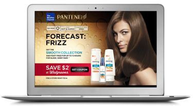
More recently, data collection has enabled companies to serve ads with creative customized in real time based on factors such as location, demographics, and even the current weather. In the example below, Pantene was able to serve an ad that directly referenced the current weather and propose their product as a real-time solution to the customer. We expect to see more custom ads like this as businesses leverage the first and second-party data available to them.
Source: P&G: Your Local Haircast
For more on paid ad strategy, watch the full Dos and Don’ts of High Impact Ad Creative webinar or reach out to our specialists at info@cybba.com.


