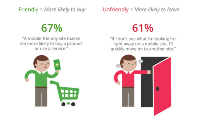
As of 2017, 48 percent of shoppers research products on their smartphones and 54 percent do price comparisons. Only 13 percent of brands, however, say they deliberately provide users with mobile-friendly experiences. This is alarming given that 61 percent of shoppers say they will leave a mobile site if they do not find what they are looking for right away. Let's look at ways we can reduce this problematic behavior and increase mobile conversions.

Since mobile shopping accounts for more than half of online transactions, businesses have huge incentives to optimize for mobile and reduce abandonment. Here are the best-practices to increase mobile conversions…and quickly.
Create a faster mobile checkout process
Hubspot found that forms with only three fields have double the conversion rates of pages with four fields. Customers do not want to engage in tedious activities, so be sure to only ask them for what is necessary. Including a progress bar will prolong their impatience since it can tell them when they will be done.
Allow customers to fill out information from past visits and give customers the option to checkout as a guest so if they are new customers, they do not have to do through the whole process of creating an account.
Limit images on mobile sites & compress their sizes
We found that 50 percent of customers will abandon a site that does not load in three seconds. Large image files will slow down your site and contribute to abandonment. Try offering only one featured image on a page or for each product, with additional images on a separate page.
Streamline your navigation
Mobile users have a smaller screen to work with than desktop browsers, so your navigation must be customized to avoid involuntary clicks. Include ways to quickly filter products so customers can find what they want.
Prioritize your search bar. Since in-store shoppers are researching specific products, your search bar should be large and at the top of your page.
Additional clicks your customers must undertake will only increase your drop-off rate, so don’t include disruptive pop-ups. Your exit-intent technology must be seamless, rather than disruptive. Get additional tips on exit-intent solutions here.

Minimize CTAs
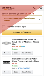
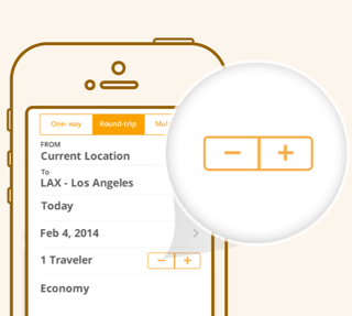
Your CTA should be “thumb friendly”, meaning it’s large in size and comfortable for a thumb to reach.
Provide security reassurances
Include in your design that your checkout is secure and protected by: _____. The people giving you their credit card numbers are likely worried about security, so drive this point home.
Use geolocation
This especially caters to those in-store researchers: use geolocation to let users pick up items at the “nearest store.” Use their GPS to find the closest location to them and check its inventory for the items they are browsing.
Bonus points if you can create a sense of urgency and scarcity by conveying, “only three items left in stock, hurry!”
Prioritize usability

Make it easy for shoppers to be in your store with your mobile capabilities. Providing QR codes so they can easily look up product information while in-store is one great way to do this. Enabling a shopper to order a product online and have it delivered to skip long checkout lines is another.
At the end of the day, or your sales season, you’ll find that the difference between a good mobile site and a bad mobile site has a tremendous impact on your revenue. It’s important to keep your site, and especially your checkout process, straightforward, focused, and light.
For additional tips and help creating an optimized customer journey, contact us for a free website audit and consultation.


