

With cart abandonment at over 70% on average a strong Email Remarketing strategy will allow you to recover revenue and boost your sales by 5% to 15% Through this blog post learn how to best design your cart abandonment emails and boost their performance!
According to Forbes, 94% of content with visuals get more total views than text only content.
Do not underestimate the importance of your email design. The point of abandonment is a critical stage of the customer journey. To get customers to come back and complete their transaction, you need an appealing remarketing email.
Keep in mind that consumers are inundated with emails. Make sure that your emails stand out in the flood of emails that they receive on a daily basis.
Branding and Imagery
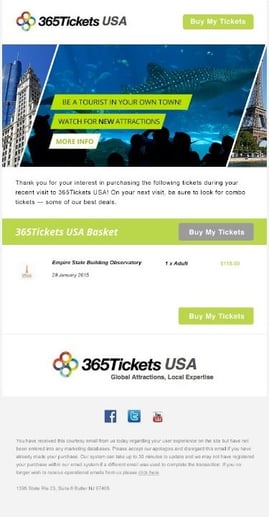
Your remarketing emails need to be visually compelling and instantly recognizable. If you’re going to capture the attention of abandoning customers, they need to immediately recognize who the email is from.
- Your email subject line will be key. Make sure your abandoning customer sees the sender and a compelling message in the subject line.
- Once your customers have opened your email, recognizable branding is key to keeping them engaged. Include your logo, and use your brand colors and imagery in your remarketing email.
- The theme of your emails should also reflect the branding of your website. From the colors and fonts to the mood and tone, you want to keep the look and feel of your website and remarketing email consistent.
Use branding and imagery to strengthen your email message, and offer a memorable and recognizable experience.
Text vs. Images
If plain text emails can deliver decent results, images will significantly attract viewers’ attention and get you clicks. For this reason, it is worthwhile to design appealing “hero” banner images for your emails. The most effective emails will cleverly use images to reinforce your overall message and CTAs.
The tricky thing here is to find the right mix between images and text. Having too many images can cause your emails to go to spam. Emails with images often get blocked by your customer’s email platform, as many ESPs are now set up to block images automatically.
Information such as price, promotions, and product description should all be presented in plain text. This way, even without your images, the reader can still understand the content of your remarketing email.
If you do include images in your email template, remember that large images take longer to load. The creative may be compelling, but if customers are frustrated by the slow load times for heavy image files, they will ignore your email.
Great CTAs
Getting your abandoning customers to click on your CTA and come back to their cart is the whole reason we are working so hard on the email re-engagement campaign.
Use clear, strong, and appealing CTAs that grab the attention of your abandoning customers. You want to persuade them to interact with your remarketing email and complete their transaction.
Your CTAs need to be eye-catching, placed clearly, and align with your brand. Customers should see a clear and frictionless path back to conversion. As a rule, your visitors should never have to look for a CTA.
- Color
To get your customer’s attention, the color of your CTA is key. Use a color that is part of your approved color palette, but also stands out over the rest of your content.
- Shape
Even the shape of your CTA can impact the number of clicks you get. Make sure that it works with the rest of your visuals, and that it looks like a button that customers should be clicking on.
- Placement
Keep the placement of your CTA central to your design as it is the focus of your remarketing email. The CTA buttons should be clearly visible from the rest of the content. Give it space to breathe so it is not cluttered or boxed in.
- Size
Although it is a given, make sure your CTA button is big enough to be clicked on easily, especially from mobile devices.
- Short and Clear Action Verbs
When deciding on the copy in your CTA, make sure that your offer is immediately apparent. Readers should be able to understand from a glance what they’ll get from a click.
Use short messages to get your point across. Pairing an action verb with an implied benefit is the best way to go. This will create a catchy action phrase like: “Buy Now” or “Get the Discount,” or “Return to Your Basket”.
Of course, make sure that your copy is in-line with your brand’s tone of voice, whether that’s funny, playful, or professional.
