
When it comes down to it, color is 85 percent of the reason why a customer purchases a specific product. In fact, it takes 90 seconds for a customer to form an opinion about a product, and 90 percent of their opinion is affected by color. So while color isn’t everything – it’s close. In this blog, we’ll examine how your website can convert more customers with its colors.
What is Color Psychology?
Color psychology stems from behavioral psychology and like everything in this science, it can be supported by tests and the scientific method.
The color of every aspect of a webpage matters. From the logo, phone number, menu bar, graphics, menu, sidebar, to the CTA, changing a color can help you optimize your site. These webpage features, however, work together and it can be difficult to isolate specific features as variables. Consider the following tips as you optimize your site:
How to Choose the Right Color
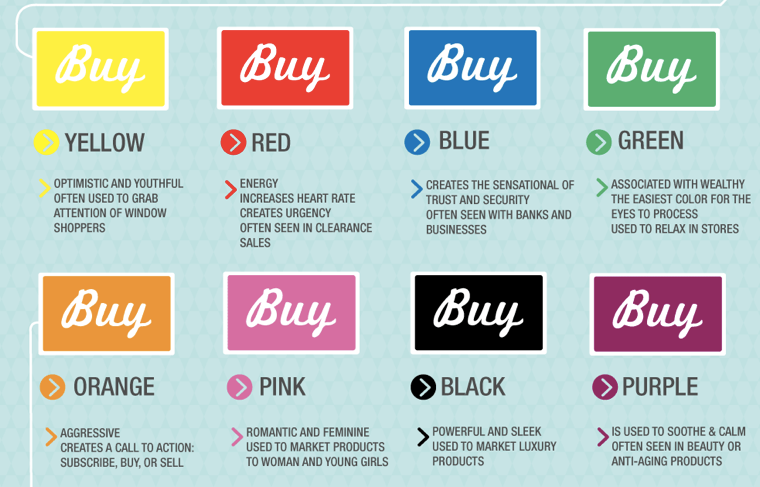
Color depends on context. When choosing the right color to cover customers, consider your audience, buyer personas, and the context in which the color is used. Here is a breakdown of colors and their contexts that marketers have studied and identified as patterns.
A caveat to the above is that colors can take different meanings among cultures. For instance, while red signals urgency in the United States and Europe, it is the color of death in Africa. White is synonymous with weddings in the USA, but it is the color of mourning for the Chinese. Yellow signals energy in the west, but is symbolic of sadness in Greece and jealousy in France.
Color and Segmentation
Though many customers associate colors similarly, different demographics have varying preferences.
With exceptions, marketers know that on average, women don’t like grey, orange, and brown. Women prefer blue, purple, and green.
Most people think that females love the color pink. This is largely untrue as it does not universally appeal to most women. Using blue, purple, and green, rather than pink, can improve the appeal of your website to female visitors and as a result, increase their time spent browsing your web pages.
Most men don’t like purple, orange, or yellow. Men like blue, green, and black. A common misconception is that men like brown, which is mostly incorrect. To many, brown is perceived as boring and ugly. When selling to men, consider using blue and green to connect with them on a deeper level.
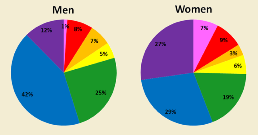
Here is a breakdown of colors as they appeal to both genders.
Additionally, colors can appeal differently to people of different ages. Younger customers are more apt to like bright, fun, colors, while older customers are put off by these, and prefer a subtler color scheme.
CTA Color: Choose Contrast
If you’re going to remember one thing from this blog, remember that your CTA is the most important part of a webpage, and it needs to pop. The most effective CTAs have contrasting color, which can be achieved by choosing a color that clashes with its background.

Per the graphic above, notice that red, orange, and yellow tend to stand out and will make strong choices for your CTA. Black, blue, and brown will blend into the background of your pages. These colors generally will not inspire customers to engage, whereas red, orange, and yellow are likely to.
Testing
While the colors in these tips have been extensively tested by marketers, there is no hard and fast rule for choosing a color to use for specific aspects of your site. To know if your colors are working, A/B test your webpage with specific variables.
While there are almost infinite color schemes you can use for your webpage and CTAs, not all colors are created equal. For more best practices on designing a webpage, converting more customers, and branding campaigns, schedule a free consultation with our experts!
